
Sailplane Grand Prix Unveils Its New Logo: A Symbol of Speed, Precision & a New Chapter
22 November 2025 - Today marks an exciting milestone in the history of the Sailplane Grand Prix. After several months of reflection, creative exploration, and collaboration, we are proud to reveal our brand-new logo - a bold, dynamic symbol designed to carry the SGP into a new era of performance, clarity, and global visibility.
This redesign is far more than a visual update. It reflects the evolution of our sport, our community, and our ambition for the next decades of competitive soaring.
A Tribute to Our Heritage
Before we look forward, we must recognize the history that brought us here. The iconic visual identity that defined the Sailplane Grand Prix for so many years was the work of Howard Jones. His design accompanied us through series after series, helping to establish the SGP as a recognizable global brand. The entire team extends its deepest gratitude to Howard for his dedication and for the foundational work he has done over the years.
Why a New Logo? A Clear Need for Modernisation
The previous SGP logo has accompanied the competition for many years and has become an instantly recognizable icon. But as the Sailplane Grand Prix expanded internationally - both in real-world racing and through new media such as livestreams, digital broadcasts, and social platforms - we felt the need to build a more modern, cleaner, and high-performance visual identity.
During internal discussions, several challenges became clear:
The previous logo featured multiple sailplanes, making it difficult to read on small screens and during live broadcasts.
The graphical complexity reduced its adaptability across digital platforms.
Our new communication channels (YouTube, Twitch, social media, TV overlays) required a simpler, bolder and more versatile mark.
The redesign was therefore guided by a single goal: preserve our heritage, but bring the SGP identity into the future.
The Creative Process
To bring this ambitious project to life, we assembled a diverse creative group of 10 contributors, including 6 experienced graphic and logo designers. Their combined expertise - from visual identity to brand architecture and competition design - allowed us to approach the Sailplane Grand Prix logo from multiple angles.
From October 2025, this group worked closely with the SGP team in a structured, iterative process that balanced creative exploration with strategic intention, and we want to thank everyone involved for their work.
The initial creative brief outlined several key expectations:
Proposing three creative directions, from conservative evolutions to bold reinventions.
Preserving a visual connection with the historical identity, without replicating it.
Integrating a single glider that would embody modernity, sportiness, and dynamism.
Developing a logo that is clean, contemporary, readable, and efficient across all digital and printed formats.
This strong foundation, combined with the designers’ creative freedom, resulted in a first series of five design paths - each offering a unique interpretation of what the Sailplane Grand Prix could become.
Throughout the process, the feedback from all contributors proved invaluable. Their critiques pushed the project forward, helped clarify our direction, and ensured that every design decision served the identity we wanted to build.
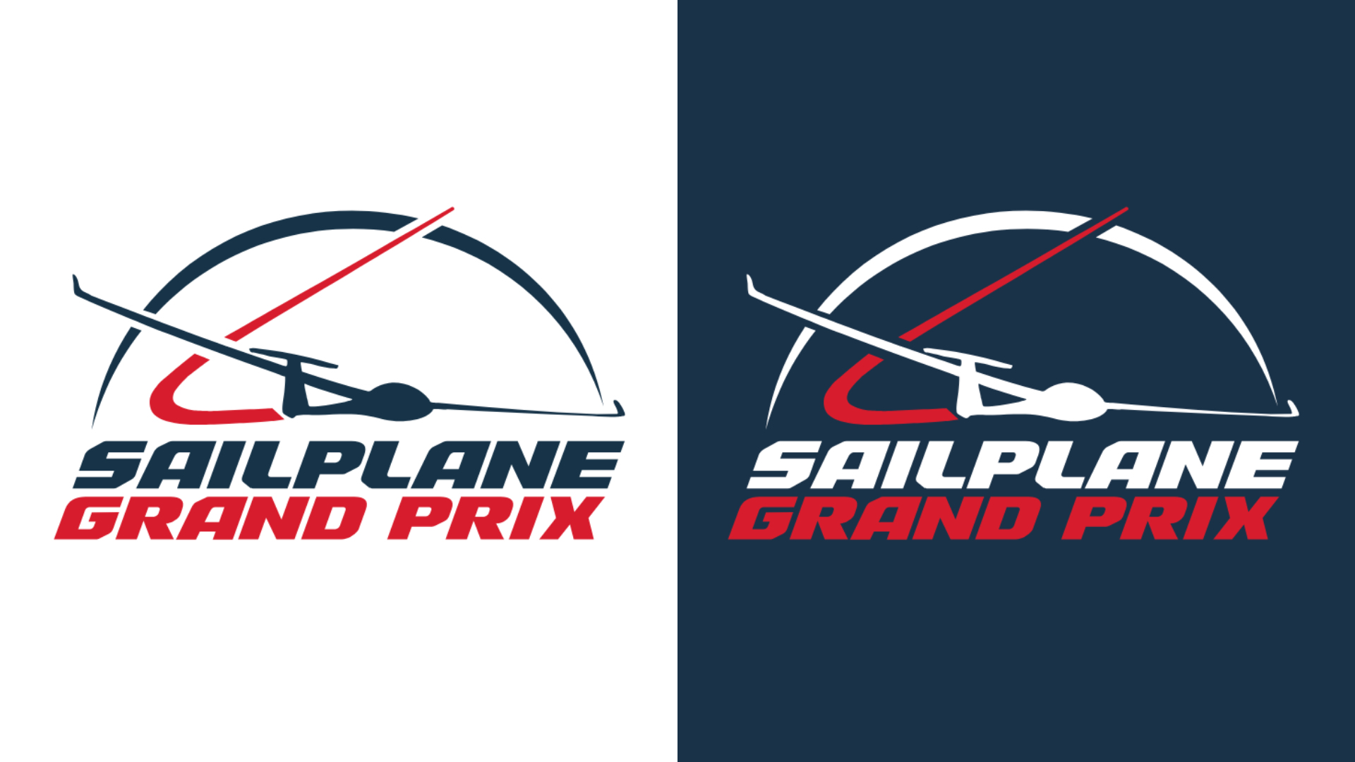
Deconstructing the New Design

1. The Glider - Modernity in Motion: We moved away from the "four glider" formation of the past, which became illegible at small sizes. The new logo features a single, high-performance sailplane - actually the same one as before, but without any shadows or canopy, or trailing lines.
2. The Semi-Circle - A Global Arena: We introduced the semi-circle to replace the literal "sun" of our previous logo. This arc serves three purposes: it reminds us the "sun" but still balances the verticality of the design, and symbolizes the globe - reinforcing the international nature of our Worldwide Series.
3. The Red Line - The Winning Trajectory: Cutting sharply through the blue arc is a vibrant red line. This isn't just decoration; it represents the race line, the strategy, and the split-second decisions that define an SGP champion. We paid special attention to this shade of red to ensure it pops against our signature Navy Blue background.
4. The Typography - Custom Built for Speed: The "Sailplane Grand Prix" wordmark is a custom adaptation that leans forward, mirroring the velocity of our sport.
A System for Every Altitude
A modern sports brand needs flexibility. We have developed a three-tier logo system:
Primary: The full icon and wordmark, used for official race results, podiums and more, alongside the FAI logo to certify our sanctioned status.
Secondary: A text-only "Wordmark" for horizontal spaces like web headers and merchandising.
Tertiary: The "SGP" Monogram. An ultra-minimalist mark designed for the smallest digital environments, ensuring we are instantly recognizable even as a social media avatar.
Each version also has a dedicated FAI co-branded variant, respecting the sanctioning requirements of the Fédération Aéronautique Internationale.
The Next Horizon
This rebrand is a statement of intent. We are building a brand that embodies our core values: Excellence, Passion, Boldness, and Community.
We are ready for the 13th Series. We are ready for the future.
Welcome to the new Sailplane Grand Prix.
